

A smarter bag, a bigger basket
- Client
- Mejuri
- Industry
- Fine jewelry, ecommerce
- Services
- Cart and mini bag UX and UI, conversion design, usability testing, interaction states, dev handoff
- Year
- 2026
The brief
Mejuri wanted the cart to do more than hold products. The moment someone adds a piece is the moment they are most open to finding the thing that goes with it, and the old cart let that moment pass.
Anna redesigned the cart as a two-step experience. Step one is a mini bag that slides in the second you add something, confirms it and suggests what pairs with it. Step two is a full expanded bag for reviewing, saving and checking out. Every state was designed for desktop and mobile and documented for dev handoff.
See it live on mejuri.comThe mini bag knows what goes with it
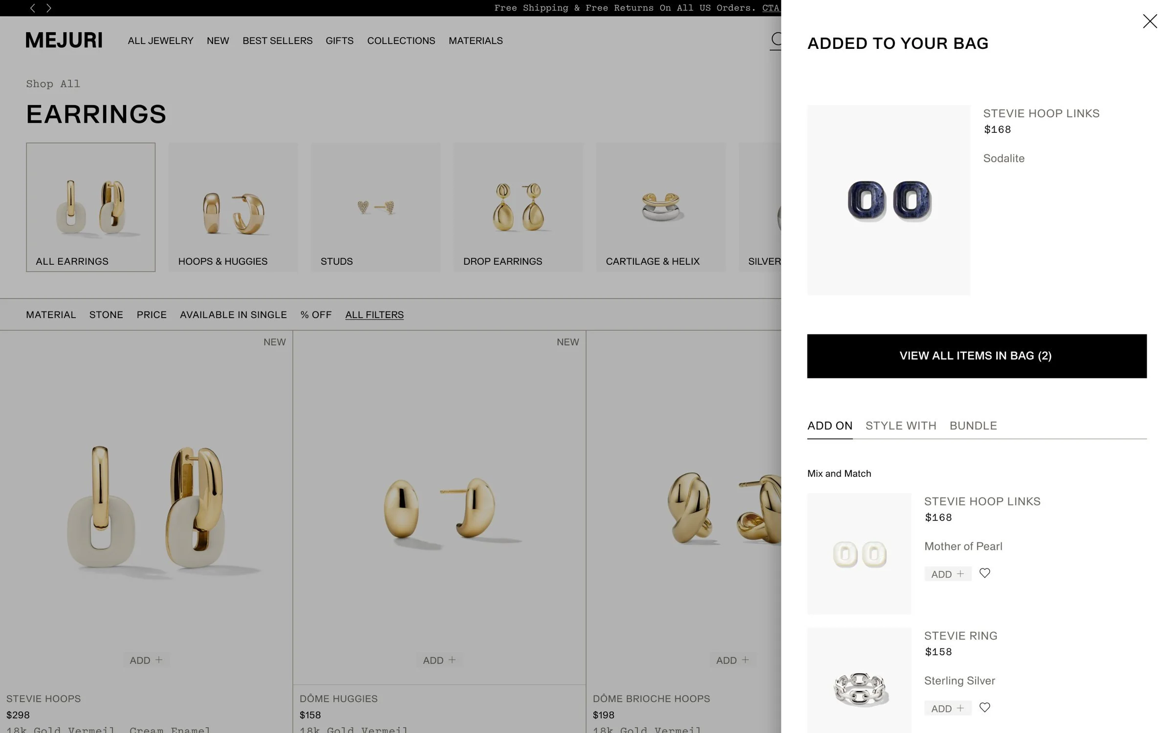
Add a piece and the mini bag slides in without taking you off the page. Below the confirmation, three tabs do the selling, and the mini bag picks which one leads based on the product. Add from here and the new piece swaps in with a success message, while the bag count and button update to match.
Built for the thumb
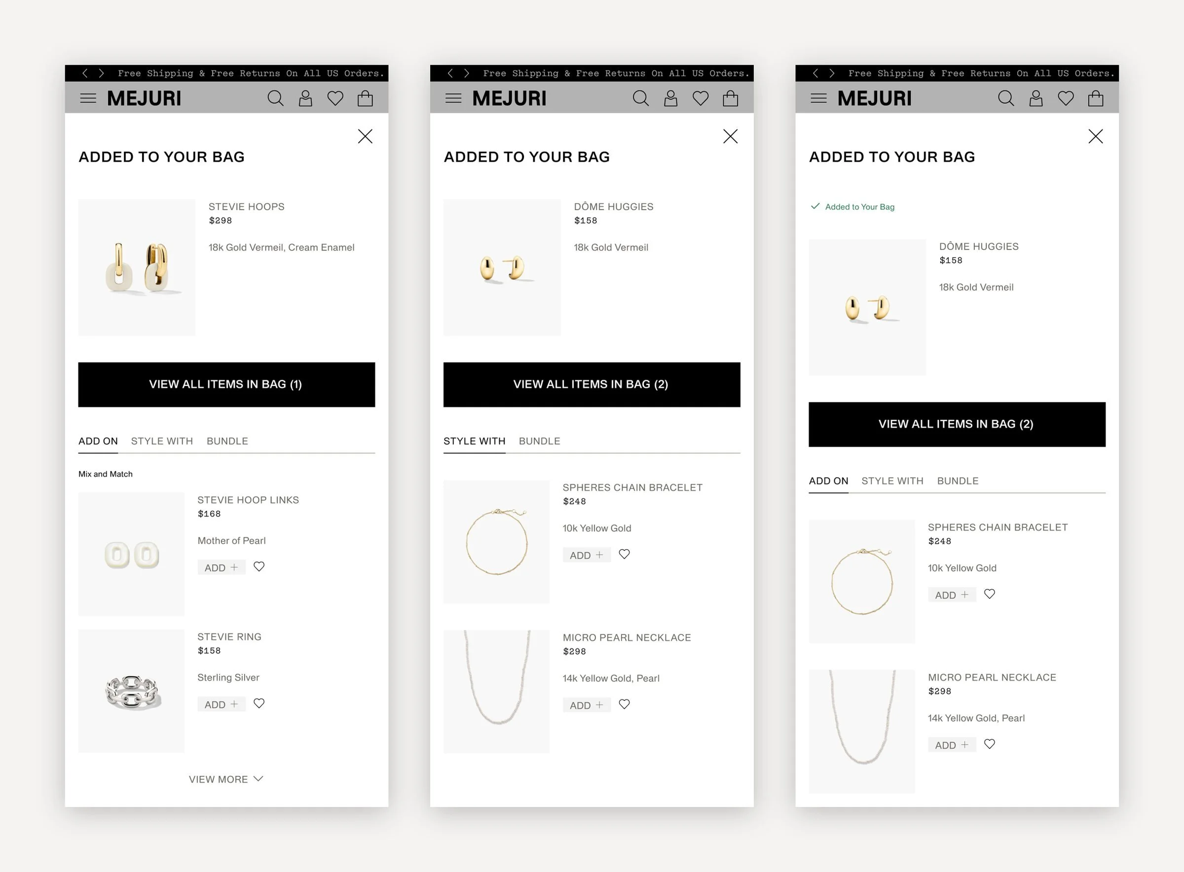
On mobile the mini bag takes the full screen with one clear path back to the bag. Promotional states, like a free shipping threshold or a gift with purchase, sit right under the confirmation so the reason to add one more is never out of sight.
Choose without leaving the page
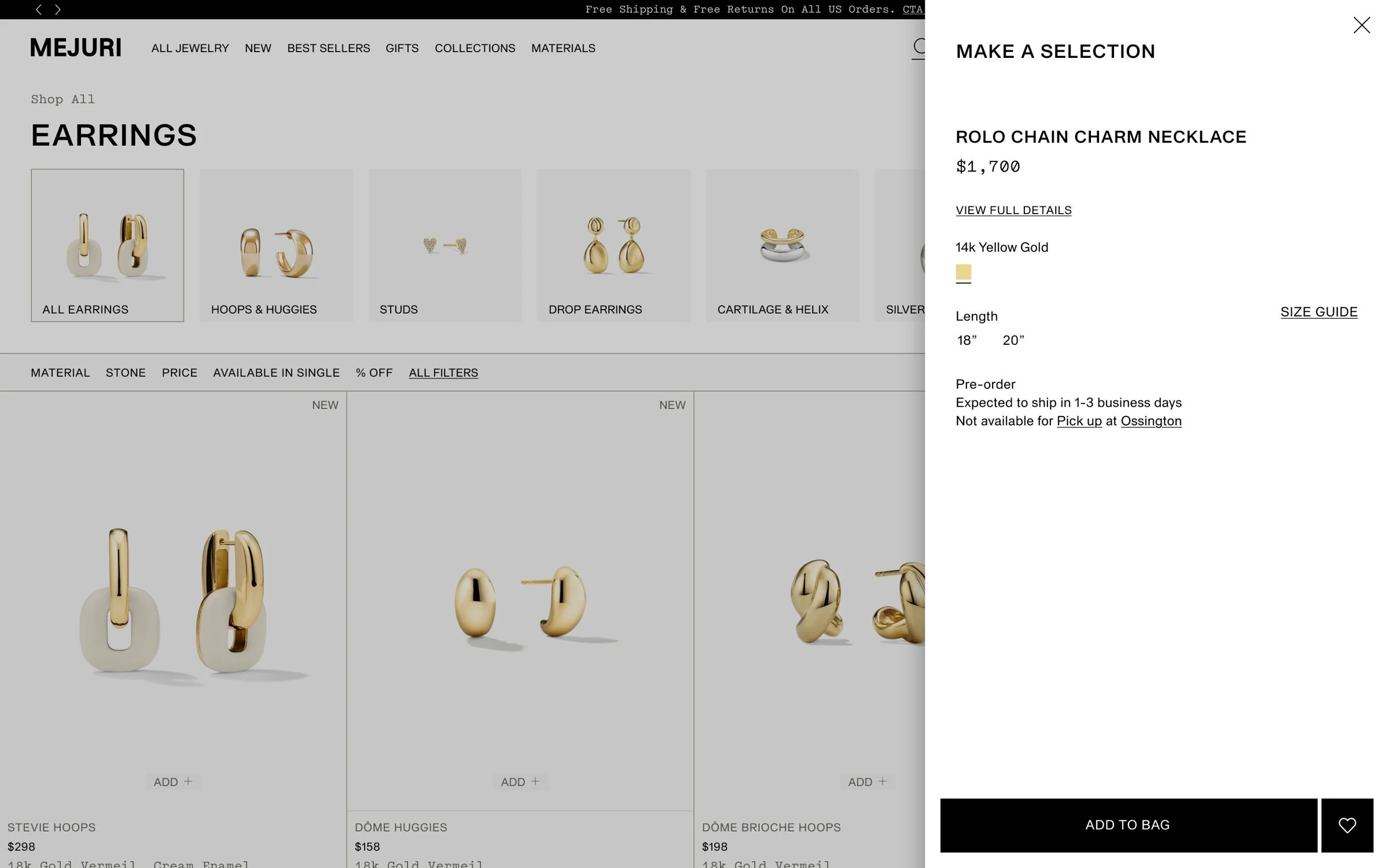
Fine jewelry comes in ring sizes, lengths, letters, birthstones and zodiac signs. Quick add opens a Make a Selection panel for each variant type, so a shopper can pick a size and add to bag straight from the product grid, then land in the mini bag.
The expanded bag
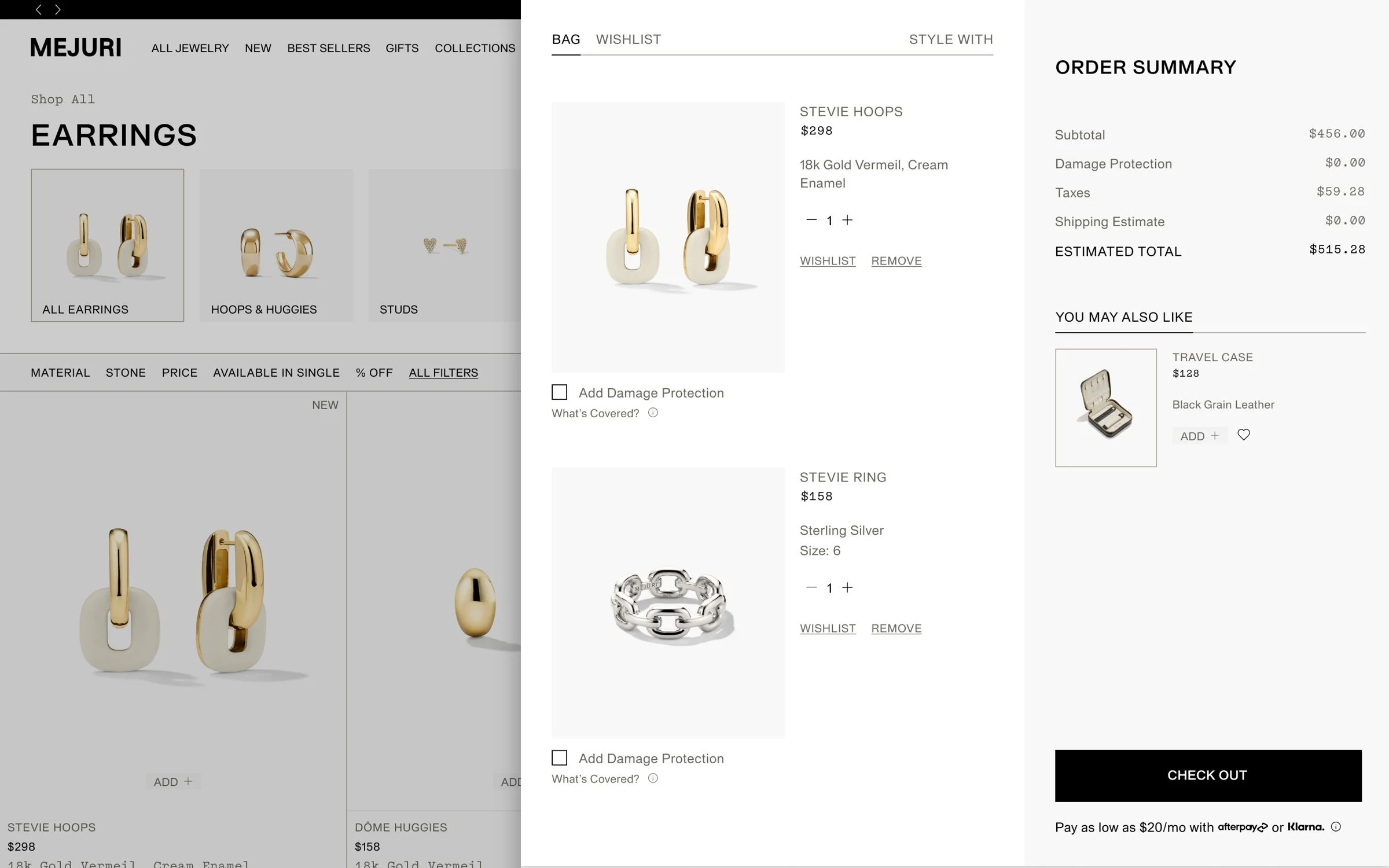
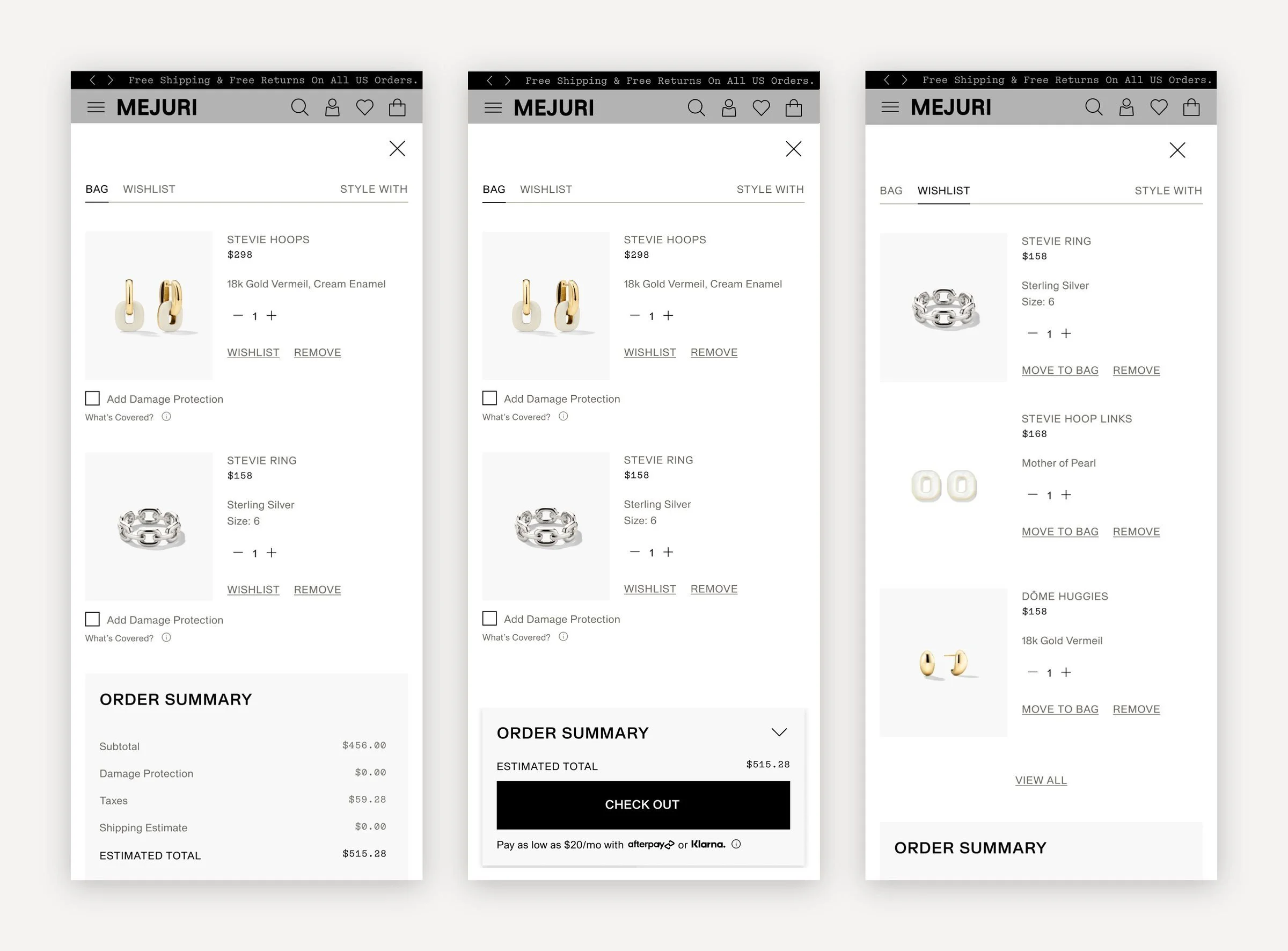
View all items opens the full bag with Bag, Wishlist and Style With side by side. Each piece can be saved to the wishlist or protected with one checkbox, and the order summary stays in view with Afterpay and Klarna under checkout. A single, low-priced suggestion, like a jewelry care kit or travel case, makes the last add an easy one.
Checkout always within reach
With a short bag, the order summary shows in full. Once the bag grows, it anchors to the bottom of the screen in a collapsed state with the total and Check Out, then opens up on its own once you reach the end of the list. The wishlist tab moves saved pieces into the bag in a tap.
Ten shoppers, two rounds
The prototype went through two rounds of moderated usability testing with five shoppers each. Every participant understood the slide-in bag straight away and read the add-ons as a way to complete the Stevie collection, not as ads.
What worked
- The bag confirms the add without pulling shoppers away from browsing.
- Add-ons read as one collection: hoops, links and the ring belong together.
- Price, material and quantity are clear the moment a piece lands in the bag.
- The clean, image-led layout keeps the focus on the jewelry.
"I actually really enjoyed the add ons feature. I think that was really clever."Usability study participant
Bigger baskets, by design.